How effective is the combination of your main product and ancillary texts?
|
|
|
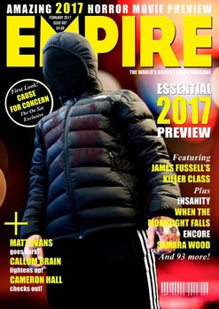
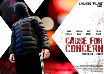
This is our finished poster and magazine for the production - Cause for Concern. The both of these go towards our brand identity and also the way we set out our trailer too. This is also carried on in our poster and magazine. The poster and magazine cover we have made in order to help promote our horror trailer are the pieces of promotion that help construct our trailer's success among movie fans and in particular, horror fans. To be successful we need to be quite unique and memorable. A well branded film and promotional methods will make sure that you have high sales and ratings because of the ever lasting popularity it has.
So that we could make our promotion material not only noticeable and eye-catching but professional too, we added some specific similarities from our trailer that we relate to our magazine and our poster. Firstly, the poster of ours has Cameron, our killer looking like he is standing over you and this causes him to be intimidating and dangerous. We also have Kate at the bottom corner of our poster so it looks even more like Cam is standing over her and the way Cam has been edited bigger emphasizes the fear from Kate. Professionally branded and well styled out promotion materials are more likely to be remembered and acknowledged among horror fans by its iconic themes.
In order to make our ancillary texts and make sure that we kept a constant theme over all three of our products, we looked at different ideas of horror material that is instantly visible to see. The more noticeable the product is, the more popular and well remembered the film will be. Making sure you design memorable and good quality branding can help your horror film to stand out from the crowd and giving value to what your identity already is. It can cause people to be drawn to you and can give you an distinct image that will always remain the main image in their minds and always remind them of that specific film.
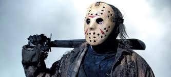
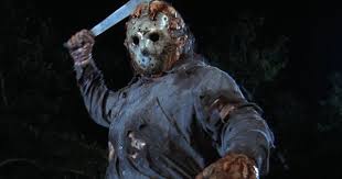
To help us choose the most iconic and significant image in our trailer, we researched other horror films that were successful and looked at their iconic images to see how effective and recognisable they are to the brand. One example that we looked at was the famous and one of the most well known horror films, Friday the 13th, which was released in 1980 and then remade in 2009. Their iconic image is the use of the mask of the killer and also Jason's sword/knife, which is what the film is most recognised for. It is what just makes the film and causes it to instantly be recognisable to horror fans. As this image became more and more popular and distinguishable as the film's image, it was used to boost the rest of the film's sequels and became the main face of the brand. Due to their effective branding, it has caused them to be one of the most recognised franchised due to their iconic imagery.
|
This is why we used this image as inspiration for creating our own media products to help go with our film. We attempted to do the same thing at making an image that is recognised straight away and links to our trailer making it a memorable and a very popular film as far as the horror industry are concerned.
|
Another thing we did was researched iconic texts in films to find out what has caused films to stay successful and be memorable in their title fonts. A good example of a film with good and memorable text that we researched was Harry Potter, this film franchise has released several films over the years of very high quality and could be considered one of the best movie series that there are. The font for Harry Potter is incredibly iconic and instantly recognisable. People who are not Harry Potter fans or some who have not watched the films will still recognise the font of the title and know exactly which film it belongs to. It is part of the iconic branding of the Harry Potter films and helps it to stand out in its promotion materials. A film with a font that is this iconic that it can represent the film entirely on its own. We were hoping to emulate this in our own font.
title
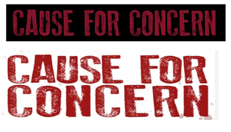
We used an iconic font throughout to create our brand - some thing a little more unusual than the usual "Times new Roman" to help our title stand out. The logo we've created for our trailer and our poster was made by making the font patchy and red to signify blood.
|
re-OCCURRING image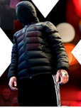
|
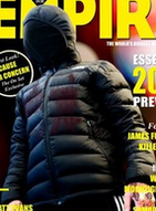
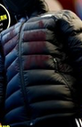
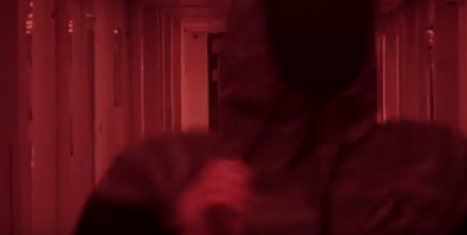
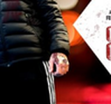
The recurring image of the boy in a hood also becomes iconic for our brand. The hood is a clever horror device - it masks identify, using the theory that killers are represented as "cyphers" in horror (Den Valdron). It also cashes in on the current zeitgeist fears that hoodies are dangerous and the scourge of socierty.
It also fits with our target audience.
It also fits with our target audience.
colour scheme
We chose to use the colours black and red because stereotypically these colours are associated with fear, danger and also blood too. It is also conventional with the genre of horror.
TAG LINEConsistent throughout all poster and magazine - "School's out Forever" - includes irony without it being overly comical.
|
|
|
