Types of HORROR POSTERS
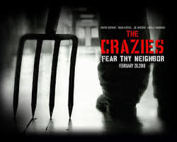
The crazies is about a bunch of people who get changed into vicious killer who kill there family and friends. The crazies is a film made in 2010 and will influence our idea in our advert for a film, The cover used here has a bright red title which will present the blood in the film, while everything else is in black and white- this is done as it shows contrast by making his weapon stand out, and shows the city is in the dark from the outside world.
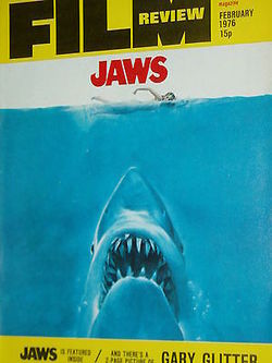
Jaws is a horror film that falls under the sub category of slasher. The film was released to audiences in 1976. On the film poster the use of red on a white background is very effective due to the connotations that both colours have, firstly the colour white can indicate pure and innocence with has a complete contrast to the colour the colour of red - which indicates to the audience the idea the film is about death, blood and horror. Not only do these two colours contrast with their connotation meanings but they also contrast on the poster making the title stand the most on the page.
`
`
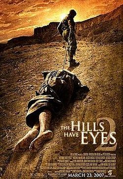
Hills of eyes 2 is a thriller/slasher that was released in 2007. The image is powerful and it makes an immediate impact to the audience. The colours are a mixture of bright and dull which makes it eye catching. The golden light represents the sun going down which means the hills can always see you. In the magazine cover it shows a dead body being dragged across the desert which links to Wes Cravens theory of a home is a safe place but in this case the body is going to the home of the mutants where victims get eaten, which goes against Wes Craven's theory.
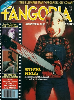
The use of the colour red gives the connotation of death, while the colour black can represent the idea of the unknown. The use of a pig mask works well due to the fact the audience cannot put a face on the killer adding an extra layer of fear to the poster. Due to the killers face being shown the audience are not aware of his expressions while he kills and dismembers others.
