Question 1
In What Ways Does Your Media Product Use, Develop Or Challenge Forms And Conventions Of Real Media Products?
poster
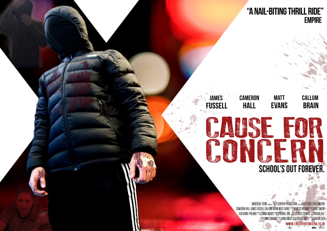
We chose to use a lot of red on our poster because in horror red is stereotypically seen as bad and blood. Other classic conventions:
- TITLE IN BOLD
- TAGLINE
- MAIN CHARACTERS
- INSTITUTIONAL INFORMATION
- WEBSITE ADDRESS
- LOGOS
- ONE CENTRAL IMAGE
- QUOTE FROM A MAGAZINE
TRAILER
Within the movie genre of horror, there were ideas produced in original material that have stuck and been held in tradition. From such traditions come common conventions which are an unauthenticated law of theories and ideas which aren't obliged during horror trailers. As a group we debated theorists collaborating with horror, taking the theorist we wanted and including them into our trailer enabling for a finished piece that followed some, however not all conventions.
A theory that our group decided to involve was with Wes Craven's, as his theory says horrors become successful in stereotypically safe places, like family homes or in our trailer a school. His theory also includes an absence of authority, like an absence of parents or in our trailer an absence of teachers bar one who was killed. Our aim was to relate with horror theory of Craven, that the subject of the trailer was to eliminate the security to make the victims feel vulnerable and the killer powerful.
The next theory which we looked into was 'Men, Women and Chainsaw' as it relates to the cliche horror scenario of a final girl. Most horror films that are based on traditional values have a final girl and so does ours. In our trailer the majority of the victims are female.
Female victim- We used 3 female victims throughout our film trailer because they are usually known to be the weaker characters when in a horror film. Using females as our victims worked out better than using males because everyone always expects the males to be stronger.
Anonymous killer- By having our killer anonymous in our film trailer it kept it a lot more mysterious. We used black clothing with a black mask and also dark lighting in order to hide the killer from the audience.
Dark locations/lighting- When we were filming our trailer we tended to use dark locations or even locations throughout the day such as the graveyard. If we filmed in the day,when we edited the clips we had to put dark effects on it in order to create atmosphere and tension in the trailer for the audience.
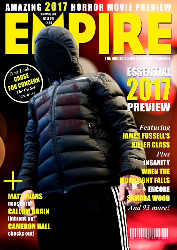
MAGAZINE
We created a very conventional magazine front cover because we wanted our product to look as real as possible.
|
|
