font choices and justifications
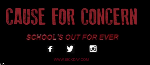
We chose to use the font "chalk dust" for our trailer because it looks like a font that is used in a school on a chalk board or whiteboard. We chose are text to be as close to one that is used in school because that is where our trailer located, also to make people feel safe while watching our trailer as a school is supposed to be in a safe place.
We picked out three fonts that we could use for the text in our trailer that we felt matched the theme of our slasher horror trailer and asked online and on social media for advice about which font is the best to use. The three fonts that we chose were:
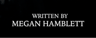
humana serif
This font was our second most popular choice. It looks bold but not very school like. We chose not to use it as it looks too familiar and stereotypical for the genre of our film. It also doesn't look like it would be found in a school either. For example, the letter "Y" in the word "BY" looks like a flower or something else that is nice and curvy. This font wasn't what we were looking for.
kino mT
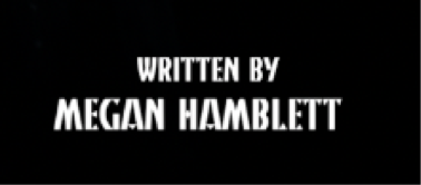
This was our least popular font choice as it is the hardest to read and it also looks like it is trying too hard to be dark and sinister. It looks like the text that you would find on children's Halloween toys which is the main reason as to why we have decided that it is best that we don't use it as we want our trailer as we wanted it to be taken seriously and not appeal to little kids.
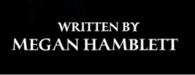
Iowan Old Style
This was our most popular font choice as it is bold, easy to read and looks similar, if not the same, to the font of the text that you find in most schools. It matches the theme of trailer so we decided that this was the most suitable font to use for it. It's simple, scary and the best font for this context.
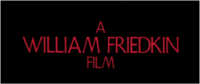
INSPIRATION
We got our inspiration from 'The Exorcist 1973' as the font choice is relatively close to what writing you would see in a school as it looks like a child's writing. We took inspiration from the font colour as we thought it would fit in with our theme of a killer with the red representing blood. As a group, we thought that red was suitable for our slasher trailer as it shows the amount of blood and killing that will be going on through our trailer.
This is our title for our trailer, we have used the basic text of "chalk board" as you can see as it looks like a font that may be used in a school, we have used the red texts that we said we were gunna use to symbolise the amount of blood that is seen in our trailer. from our feedback we know this was a good font to use in our trailer as it went with a are idea well.